You've spent three hours wrestling with visualization software, trying to transform your data into something that doesn't look like it was made in 2005. Your subscription to that premium infographic tool costs $30/month, and you still need to watch a 45-minute tutorial just to add animation to a bar chart. Meanwhile, your presentation is due tomorrow, and you're nowhere near finished.
Sound familiar? Data visualization shouldn't require a design degree, coding expertise, or expensive software subscriptions. Yet for most professionals, creating interactive, animated, and genuinely engaging data visualizations feels like an impossible task. Static charts bore audiences. Manual design work drains hours. And the learning curve for professional tools feels steeper than Mount Everest.
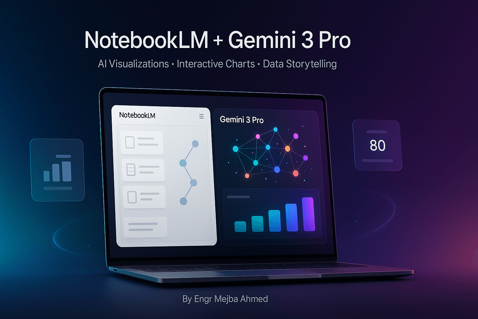
But what if you could create constellation maps, animated bar charts, interactive strategy boards, and professional infographics using completely free AI tools—without writing a single line of code? That's exactly what happens when you combine Google's NotebookLM with Gemini 3 Pro.
What Are NotebookLM and Gemini 3 Pro?
NotebookLM is Google's AI-powered research assistant that aggregates, organizes, and analyzes information from multiple sources. Think of it as your intelligent research partner that can pull data from Google Workspace files, websites, YouTube videos, PDFs, and even conduct multi-source web searches on your behalf. It doesn't just dump information—it structures it, summarizes it, and transforms it into formats like mind maps and organized reports.
Gemini 3 Pro is Google's advanced AI model available for free through Google AI Studio. While many know it for text generation, its true superpower lies in creating interactive, HTML-based visualizations from structured data. It transforms simple data inputs into dynamic, animated, professional-grade visual content that would typically require specialized design software or coding skills.
When you use these tools together, you unlock a workflow that takes you from raw information to polished, interactive visualizations in minutes instead of hours. You're not just saving time—you're accessing capabilities that were previously locked behind paywalls or technical barriers.
Why This Workflow Solves Real Problems
The Pain of Manual Visualization
Every analyst, marketer, educator, and business professional faces the same frustrations. You need to present complex data in ways that engage your audience, but traditional tools create bottlenecks. Design software like Adobe Illustrator requires expertise most people don't have. Coding interactive visualizations demands JavaScript knowledge. Even "user-friendly" tools like Canva or Tableau have limitations—either they're too simplistic for complex data or too expensive for regular use.
The Research Organization Nightmare
Before you can even visualize data, you need to gather it. This means opening dozens of browser tabs, copying information from PDFs, transcribing key points from videos, and somehow organizing all of this into a coherent structure. This research phase alone can consume hours of productive time.
The Interactivity Problem
Static charts are forgettable. Your audience glances at them and moves on. But creating interactive visualizations—where users can hover for details, filter data, or watch animations—typically requires web development skills. Most professionals simply give up on interactivity because it's too complex.
How This Workflow Addresses Every Pain Point
The NotebookLM + Gemini 3 Pro workflow eliminates these barriers completely. NotebookLM handles the research and organization phase automatically, discovering sources, importing diverse file types, and structuring information into mind maps or datasets. You're not juggling tabs or manually organizing research—the AI does it for you.
Gemini 3 Pro then transforms this structured data into sophisticated visualizations without requiring any design or coding knowledge. Want an animated bar chart showing GDP growth over 70 years? Feed it the data and describe what you want. Need a constellation map with color-coded clusters and hover text? It generates the complete interactive HTML in seconds.
The entire workflow is free. No subscriptions, no expensive software licenses, no coding bootcamps. Just two powerful AI tools working in harmony to give you professional-grade outputs that would otherwise cost hundreds of dollars and hours of specialized training.
The Complete Workflow: Step-by-Step Guide
Step 1: Research and Data Collection with NotebookLM
Start by opening NotebookLM and creating a new notebook for your project. The "discover sources" feature is your secret weapon here—it automatically searches the web across multiple credible sources based on your topic.
Let's say you need information about AI skills and labor market trends for 2025. Instead of manually searching Google and visiting dozens of sites, you simply ask NotebookLM to discover sources on "AI skills labor market trends 2025." Within moments, it pulls information from academic sources, industry reports, and authoritative websites.
You can also directly import existing resources. Drag and drop PDFs, paste website URLs, add links to YouTube videos, or connect Google Workspace files. NotebookLM accepts Google Docs, Sheets, Slides, markdown files, and plain text. This flexibility means all your research lives in one organized space.
Step 2: Structuring Data and Generating Mind Maps
Once your sources are loaded, use NotebookLM's chat panel to extract and structure information. This is where the magic begins. Instead of reading through hundreds of pages manually, you have a conversation with your AI research assistant.
Ask it to "create a mind map of AI skills categorized by technical, soft, and industry-specific skills." NotebookLM analyzes all your sources and generates a structured mind map with clear hierarchies and relationships. Each node contains relevant information extracted from your sources.
For numerical or statistical data, request clean, structured output. If you need GDP growth data for the top 10 countries over 70 years, tell NotebookLM exactly what format you want—perhaps a table with years as rows and countries as columns. The AI extracts this data from your sources and formats it precisely as requested.
The key is being specific about your desired structure. The better you describe what you need, the more useful NotebookLM's output becomes for the next phase.
Step 3: Transferring to Google AI Studio (Gemini 3 Pro)
Navigate to Google AI Studio and access Gemini 3 Pro—completely free, no waiting lists, no credit card required. This is where your structured data transforms into visual brilliance.
If you created a mind map in NotebookLM, you can export it or simply copy the structured text. Upload this to Gemini 3 Pro or paste it directly into the prompt window. If you have tabular data or statistics, paste that as well.
The prompt you write here determines your output quality. Be specific about what you want. Don't just say "make a visualization." Instead, write something like: "Create an interactive constellation map with six clusters representing different AI skill categories. Use color-coded nodes with hover text showing skill descriptions. Make it HTML-based with animation when nodes are clicked."
Gemini 3 Pro understands these detailed instructions and has the capability to generate exactly what you describe.
Step 4: Generating Interactive Visualizations
When you run your prompt, Gemini 3 Pro begins generating code for your visualization. You'll see HTML, CSS, and JavaScript being written in real-time—but you don't need to understand any of it. The AI handles all the technical complexity.
Within seconds to minutes (depending on complexity), you'll see a preview of your visualization. This is where you realize the power of this workflow:
Constellation maps appear with beautifully arranged nodes, connected by relationship lines, each cluster in a different color. Hover over any node and detailed information pops up. Click nodes to highlight connected relationships.
Animated bar charts start playing automatically, showing bars racing across the screen as data changes over time. Countries compete for position as GDP figures fluctuate year by year, creating a compelling data story.
Interactive strategy boards display tools or options organized by multiple criteria—maturity level, cost-value ratio, strategic importance. Filters let you sort by any dimension, revealing insights that static charts would miss.
Infographics render with professional layouts, modern color palettes (soft blues, grays, accent colors), clear visual hierarchies, and icons that enhance understanding. Sections flow logically, guiding readers through complex information effortlessly.
If something isn't quite right, you can refine your prompt and regenerate. The iterative process is fast and forgiving.
Step 5: Download and Implementation
Once satisfied with your visualization, download the generated HTML file. This is a complete, standalone file that works in any modern web browser. No hosting required, no dependencies, no complex setup.
Open the file in full-screen mode for presentations. Your audience sees smooth animations, can interact with elements, and experiences data in ways static slides never achieve. You can also embed these visualizations in websites, share them with colleagues, or include them in reports.
The HTML files are portable and self-contained, making them perfect for any professional context where you need to present data compellingly.
4 Powerful Use Cases with Examples
Example 1: AI Skills Labor Market Trends (Constellation Map)
The Challenge: You're writing a report on which AI skills will be most valuable in 2025. The data is complex—dozens of skills across multiple categories (technical, soft skills, industry-specific), with interconnections and varying levels of demand.
The Solution: Use NotebookLM to discover current research on AI labor market trends. Ask it to organize findings into a mind map with six main clusters: Machine Learning, Natural Language Processing, Computer Vision, AI Ethics, Data Science, and Industry Applications.
Transfer this mind map to Gemini 3 Pro with the prompt: "Create an interactive constellation map where each AI skill category is a different colored cluster. Include individual skills as nodes with hover text describing demand levels and salary ranges. Add connecting lines to show skill relationships."
The Result: A stunning visual where technical skills appear in blue clusters, soft skills in green, industry applications in orange. Hover over "Prompt Engineering" and see its projected job growth. Click on "AI Ethics" to see all related skills highlighted. Your report goes from boring bullet points to an engaging, explorable data experience.
Use Cases: Career planning guides, labor market research reports, educational curriculum development, workforce training programs.
Example 2: Economic Data Animation (Animated Bar Chart)
The Challenge: You need to show GDP growth for the top 10 countries over 70 years in a way that tells a story, not just displays numbers.
The Solution: Import economic datasets into NotebookLM or find sources with historical GDP data. Ask NotebookLM to extract and structure the data by year and country, ensuring clean numerical output.
Paste this into Gemini 3 Pro with the prompt: "Create an animated bar chart showing GDP growth rankings from 1950 to 2020. Bars should race across the screen as years progress, with country names labeled. Use different colors for each country and display the current year prominently."
The Result: An animated chart where you watch China's bar grow from nearly invisible in 1950 to racing past other nations in the 2000s. India rises steadily. European countries shift positions. The animation creates a narrative—you're not just seeing data, you're watching economic history unfold.
Use Cases: Economic presentations, financial reports, educational content on global economics, investment trend analysis.
Example 3: Business Tool Analysis (Interactive Strategy Board)
The Challenge: Your team is evaluating 15 different AI tools for business adoption. Each has different maturity levels, costs, potential ROI, and implementation barriers. Presenting this in a spreadsheet is overwhelming.
The Solution: Use NotebookLM to gather information on each tool from vendor websites, review sites, and case studies. Ask it to create a structured dataset with columns for Tool Name, Maturity Level, Cost Category, Value Potential, and Top Adoption Barrier.
Feed this to Gemini 3 Pro: "Create an interactive strategy board displaying these AI tools. Add filters for maturity (emerging, growing, mature), cost-value ratio, and primary use case. Enable sorting by any criterion. Use color coding to show strategic priority—green for quick wins, yellow for strategic investments, red for future consideration."
The Result: A dynamic board where your team can filter to see only mature, low-cost tools with high ROI—instantly identifying quick wins. Switch filters to view emerging technologies worth monitoring. Sort by adoption barriers to understand implementation challenges. Every stakeholder can explore the data from their perspective.
Use Cases: Technology selection processes, strategic planning sessions, vendor evaluations, digital transformation roadmaps.
Example 4: Document Summarization (Professional Infographic)
The Challenge: You have a 50-page PDF report on "The AI Revolution" that needs to be condensed into a shareable, visually appealing summary for executives who won't read 50 pages.
The Solution: Upload the PDF to NotebookLM and ask it to extract the five most important insights, key statistics, and recommended actions. Request a structured summary with clear sections.
Take this summary to Gemini 3 Pro: "Create a professional infographic with five main sections, each with an icon, headline, 2-3 bullet points, and a key statistic. Use a modern color palette with soft blues and grays. Include a clean layout with clear visual hierarchy and plenty of white space."
The Result: A polished, single-page infographic that captures the essence of the 50-page report. Icons make sections instantly recognizable. Statistics jump out visually. The layout guides readers through information logically. Executives can grasp the content in 90 seconds.
Use Cases: Executive summaries, report digests, knowledge sharing, content marketing, conference handouts.
Key Features and Benefits
1. Zero Cost, Maximum Impact: Both NotebookLM and Gemini 3 Pro are completely free. You're accessing enterprise-level capabilities without any subscription fees or hidden costs.
2. No Coding Required: You don't need to know HTML, CSS, JavaScript, or any programming language. Natural language prompts are all you need.
3. Multi-Source Data Integration: Pull information from websites, PDFs, videos, documents, and live web searches—all in one workflow.
4. Professional-Grade Outputs: The visualizations rival those from expensive design software, with modern aesthetics and sophisticated interactivity.
5. Time Savings of 70-90%: What takes hours in traditional tools happens in minutes with this AI-powered workflow.
6. Interactivity Without Complexity: Add hover effects, filters, animations, and dynamic sorting without touching code.
7. Portable and Shareable: HTML outputs work everywhere—in presentations, on websites, in emails, or as standalone files.
8. Iterative Refinement: Don't like the first result? Refine your prompt and regenerate in seconds. Experimentation is fast and frictionless.
9. Scales to Any Complexity: Whether you're visualizing 10 data points or 10,000, the workflow handles it with the same ease.
10. Future-Proof Skillset: Learning to orchestrate AI tools is infinitely more valuable than learning specific software that may become obsolete.
Types of Visualizations You Can Create
Constellation Maps
Perfect for showing complex relationships and categorizations. Use when you have data with multiple dimensions, categories, and interconnections. Ideal for skill taxonomies, concept relationships, organizational structures, or knowledge graphs.
Key Features: Color-coded clusters, hover text for details, clickable nodes that highlight connections, adjustable layouts, relationship lines showing connections.
Animated Bar Charts
Best for time-series data where rankings or values change over time. The animation creates narrative momentum, making data trends obvious and memorable.
Key Features: Smooth transitions between time periods, automatic sorting and re-ranking, custom color schemes per category, prominent year/period display, pause and replay controls.
Interactive Strategy Boards
Use for decision-making scenarios with multiple options evaluated across various criteria. Perfect for vendor selection, strategic planning, or comparative analysis.
Key Features: Multi-dimensional filtering, dynamic sorting by any criterion, color-coded priority levels, expandable detail views, customizable evaluation frameworks.
Professional Infographics
Ideal for summarizing complex information in digestible visual formats. Best for reports, presentations, social media, or any context where information needs to be both beautiful and functional.
Key Features: Modern design aesthetics, icon integration, clear visual hierarchy, section-based organization, balanced use of color and white space, mobile-responsive layouts.
Mind Map Visualizations
Great for brainstorming outputs, concept exploration, or showing hierarchical information structures.
Key Features: Expandable/collapsible branches, multiple hierarchy levels, visual connection indicators, zoom and pan functionality.
Data Dashboards
Combine multiple visualization types into comprehensive dashboards that provide at-a-glance insights across various metrics.
Key Features: Multiple chart types in one view, real-time data representation, coordinated interactions between elements, customizable layouts.
Best Practices and Pro Tips
Crafting Effective Prompts for Gemini 3 Pro
Be specific about visual style. Instead of "make a chart," say "create a horizontal bar chart with soft blue bars, white background, and rounded corners."
Specify interactivity explicitly. Describe exactly what should happen on hover, click, or filter. "When hovering over a data point, display the exact value and percentage change from previous year."
Define your color palette. Mention specific colors or color schemes: "Use a color palette of navy blue (#1e3a8a), sky blue (#0ea5e9), and gray (#6b7280)."
Request responsive design. Add "make it mobile-responsive with appropriate sizing for both desktop and mobile screens" to ensure versatility.
Include data labels and legends. Explicitly ask for "clear axis labels, a legend explaining color codes, and data source attribution at the bottom."
Optimizing Data Structure in NotebookLM
Clean data first. When asking NotebookLM to structure data, request specific formats: "Create a table with headers in the first row, one country per row, years as columns."
Validate sources. Check that NotebookLM is pulling from credible sources. You can ask it to cite sources for specific data points.
Iterate on structure. Your first mind map or data structure might not be perfect. Ask NotebookLM to reorganize or reformat until it matches what Gemini 3 Pro needs.
Use consistent terminology. When categorizing information, use consistent category names. This makes visualizations cleaner and more professional.
Common Mistakes to Avoid
Don't skip the research phase. Jumping straight to Gemini 3 Pro with poorly structured data yields poor results. Let NotebookLM do the heavy lifting of organization first.
Avoid vague prompts. "Make it look good" doesn't give Gemini 3 Pro enough direction. Specific instructions yield specific, high-quality results.
Don't overload single visualizations. Trying to show too much in one chart creates confusion. Break complex data into multiple focused visualizations.
Don't ignore mobile users. Always request responsive designs if your visualization might be viewed on phones or tablets.
Tips for Maximum Visual Impact
Use animation purposefully. Animations should reveal insights or tell stories, not just exist for decoration. Animated bar charts work because they show change over time narratively.
Limit color palettes. Three to five colors maximum. Too many colors create visual chaos rather than clarity.
Prioritize white space. Don't fill every pixel. White space (or background space) helps eyes rest and content breathe.
Test interactivity. After generating a visualization, actually interact with it. Click everything, hover over all elements, use all filters. Make sure it works as intended.
Consider your audience. Executives need different visualizations than data scientists. Tailor complexity and interactivity to who will use it.
Who Should Use This Workflow?
Data Analysts and Business Intelligence Professionals
You work with data daily but spend too much time fighting with visualization tools. This workflow lets you focus on insights rather than technical implementation. Create interactive dashboards for stakeholders without writing Python or JavaScript.
Marketing Professionals and Content Creators
You need eye-catching visuals for presentations, reports, and campaigns. This workflow produces social-media-ready infographics and animated content that drives engagement without requiring a design team.
Educators and Trainers
Explain complex concepts through interactive visualizations that students can explore at their own pace. Create constellation maps of knowledge domains or animated timelines of historical events.
Business Strategists and Consultants
Present recommendations with interactive strategy boards that let clients filter options by their priorities. Show scenario planning with animated charts that reveal different strategic paths.
Researchers and Academics
Summarize research findings in visually compelling ways for conferences, papers, or grant applications. Transform dense academic data into accessible visualizations.
Product Managers and UX Designers
Visualize user research findings, feature priorities, or product roadmaps. Create interactive boards showing feature maturity, user impact, and development complexity.
Financial Analysts and Investment Professionals
Animate financial trends, compare investment options across multiple criteria, or visualize portfolio allocations with interactive elements.
Skill Level Required: Absolute beginner to advanced. If you can describe what you want in plain English, you can create professional visualizations. No design background, no coding experience, no expensive training needed.
Limitations and Considerations
When Traditional Tools Might Be Better
Real-time data connections: If you need visualizations that update automatically with live data feeds, traditional BI tools like Tableau or Power BI have native database connections this workflow lacks.
Pixel-perfect brand requirements: If your organization has extremely strict brand guidelines down to the pixel level, traditional design software might offer more granular control.
Collaborative editing: Multiple people simultaneously editing the same visualization is easier in purpose-built tools than in this AI-based workflow.
Very large datasets: While this workflow can handle substantial data, truly massive datasets (millions of rows) might perform better in specialized data visualization platforms.
Current Limitations
Iteration requires regeneration: Unlike traditional software where you click to change a color, here you adjust your prompt and regenerate. This is fast but not quite as immediate as direct manipulation.
Learning prompt engineering: There's a skill to writing effective prompts. Your first few attempts might not yield perfect results as you learn what works.
Limited customization after generation: Once the HTML is generated, making small tweaks requires either regenerating with an adjusted prompt or manually editing code (which defeats the no-coding advantage).
No built-in version control: You'll want to save multiple versions of prompts and outputs manually. There's no automatic versioning like in some professional tools.
Future Potential
This workflow will only get more powerful. As Gemini models improve, visualizations will become more sophisticated. As NotebookLM adds features, research organization will get even easier. The combination of these tools represents the future of accessible, AI-powered data visualization.
The limitations today are minor compared to the capabilities unlocked. For 90% of professional visualization needs, this workflow provides everything you need without the costs, complexity, or learning curves of traditional alternatives.
Getting Started: Quick Start Guide
What You Need
- Google account (free)
- Access to Google AI Studio (free, no waitlist)
- Access to NotebookLM (free)
- A modern web browser (Chrome, Firefox, Safari, Edge)
- Data or a topic you want to visualize
Your First Project: 30-Minute Challenge
Choose a simple dataset: Find publicly available data like "Top 10 cities by population" or "Monthly temperatures in your city over a year."
Open NotebookLM: Create a new notebook, paste a source URL about your topic, or upload a simple data file.
Structure the data: Ask NotebookLM to "create a table showing [your data] with clear column headers."
Open Google AI Studio: Navigate to Gemini 3 Pro.
Write a clear prompt: "Create an animated bar chart showing [your data]. Use colors [specify colors]. Add hover text showing exact values. Make it HTML-based and interactive."
Generate and preview: Watch your visualization come to life.
Download and open: Save the HTML file and open it in your browser.
Experiment: Try asking for a different type of visualization with the same data.
This simple project will teach you the entire workflow in under 30 minutes. You'll understand how the tools connect and what's possible.
Recommended Learning Path
Week 1: Create three simple visualizations (bar chart, pie chart, line graph) to master basic prompting.
Week 2: Try a constellation map with a mind map from NotebookLM to understand complex visualizations.
Week 3: Build an interactive strategy board with filtering to explore advanced interactivity.
Week 4: Create a professional infographic summarizing a document or article.
By the end of this month-long practice, you'll be creating visualizations that impress colleagues and save hours of work.
Resources for Learning More
- Google AI Studio documentation for Gemini 3 Pro capabilities
- NotebookLM help center for mastering source discovery and organization
- Community forums where users share prompt templates and examples
- YouTube tutorials showing real-world workflow applications
Conclusion
The frustration of spending hours on data visualization is now optional. You don't need expensive subscriptions to Tableau, Adobe Illustrator expertise, or JavaScript coding skills to create interactive, animated, professional-grade visualizations.
By combining NotebookLM's research and organization capabilities with Gemini 3 Pro's visualization generation, you've unlocked a workflow that was impossible just months ago. Free tools. No coding. Professional outputs. What used to take an afternoon now takes 15 minutes.
The transformation isn't just about time saved—it's about democratized access to powerful communication tools. Whether you're an analyst presenting quarterly results, an educator explaining complex concepts, or a marketer creating compelling content, you now have the same capabilities as teams with dedicated designers and developers.
Start with something simple. Pick a dataset you've been meaning to visualize. Open NotebookLM and Google AI Studio. Follow the workflow. Within 30 minutes, you'll have created something that would have taken hours using traditional methods.
The barrier to compelling data visualization has disappeared. The only question is: what will you create first?
🤝 Hire / Work with me:
- 🔗 Fiverr (custom builds, integrations, performance): fiverr.com/s/EgxYmWD
- 🌐 Mejba Personal Portfolio: mejba.me
- 🏢 Ramlit Limited: ramlit.com
- 🎨 ColorPark Creative Agency: colorpark.io
- 🛡 xCyberSecurity Global Services: xcybersecurity.io