
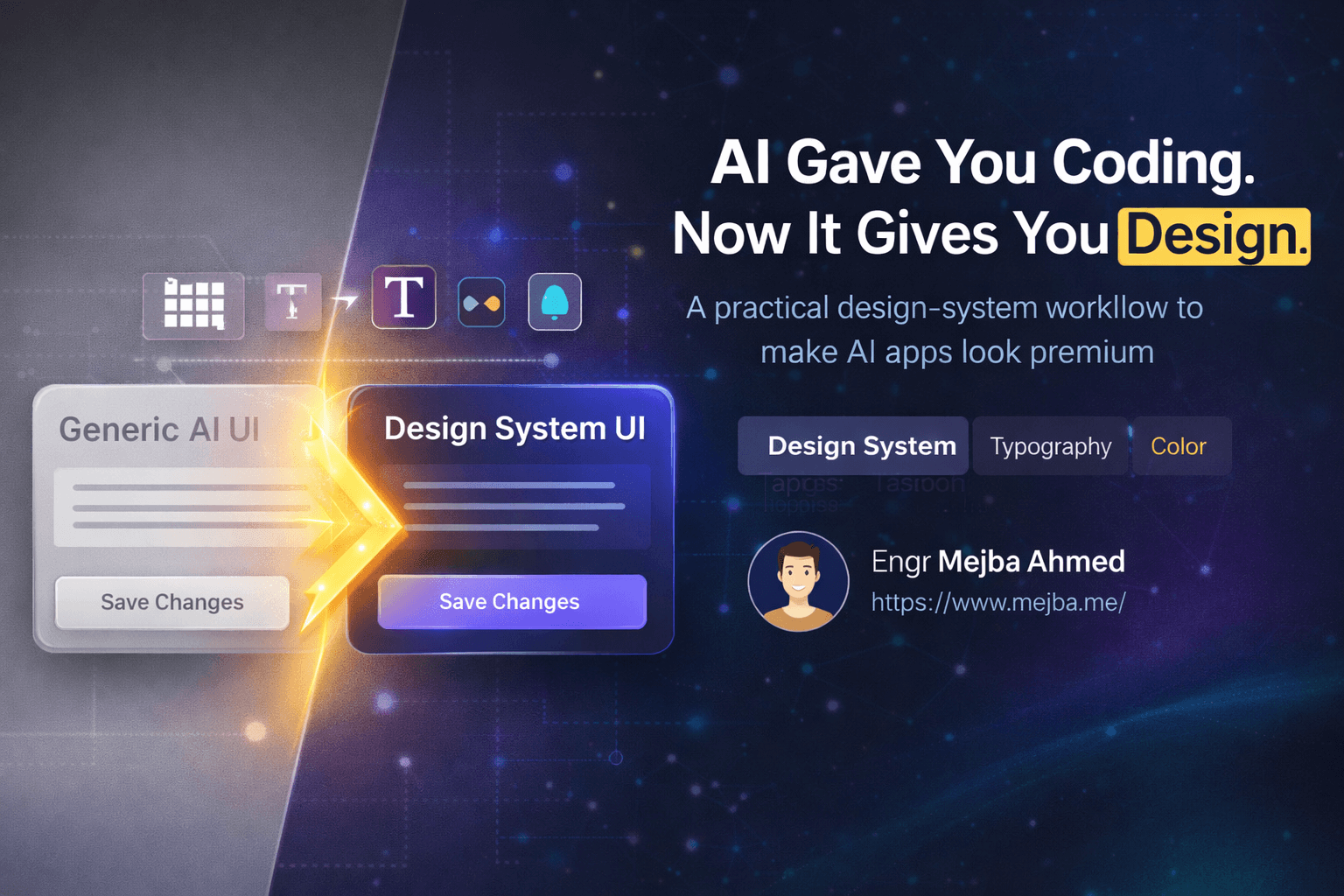
AI Gave You Coding. Now It Gives You Design.
I've built dozens of apps with AI coding tools over the past year. Functional apps. Apps that work. Apps that solve real problems. But if I'm being honest, most of them looked like they were designed by someone who learned UI from a 2015 Bootstrap tutorial during a layover. Purple gradients, generic spacing, rounded corners that felt random rather than intentional.
The functionality was there. The design was missing.
This gap haunted me because I knew better. I'd seen beautiful applications. I understood that spacing and typography and color harmony mattered. But design always felt like this mystical skill reserved for people who went to art school or had some innate visual intuition I lacked. So I defaulted to what most developers do—functional over beautiful, hoping users wouldn't notice.
Then I discovered something that changed my approach entirely. The same AI tools that taught us to build apps can teach us to design them. Not in some vague "make it prettier" way, but with specific techniques, vocabulary, and systematic approaches that produce genuinely polished results. After weeks of experimentation, I've developed a workflow that consistently transforms generic-looking apps into something I'm actually proud to show clients.
Here's everything I learned.
The Problem With AI-Generated Design
Before diving into solutions, let me describe the problem precisely. When you ask an AI coding assistant to build an app, it generates functional code with reasonable defaults. These defaults typically include standard spacing, neutral colors, and safe typography choices. The result works, but it looks like every other AI-generated app.
You've seen this aesthetic. Slightly washed-out color palettes. Buttons that are just sitting there without visual hierarchy. Typography that's technically readable but lacks personality. White backgrounds with gray text that reads "I didn't think about design at all."
The deeper issue is that developers often don't know what to ask for. Saying "make it look better" gives AI nothing actionable. It's like asking a chef to "make it taste good" without specifying whether you want spicy, savory, sweet, or umami. Without precise vocabulary and clear direction, AI defaults to safe mediocrity.
This is the barrier most people hit. They know their app looks generic but lack the design knowledge to articulate what should change. Breaking through requires two things: understanding fundamental design concepts and knowing how to communicate them to AI.
The Screenshot-to-Redesign Workflow
The most powerful technique I've found starts with a simple action: taking a screenshot. Whether you have an existing app that needs improvement or you're starting fresh, screenshots become your communication tool with AI.
Here's the workflow. Take a screenshot of your current app or a specific section that needs work. Upload it to an AI image generator like ChatGPT, Gemini, or any multimodal AI. Prompt it with a specific visual direction.
The prompt matters more than most people realize. Instead of vague requests, I use structured prompts like this:
"Please redesign this UI as a visual mockup using a flower-inspired theme. The redesign should feel open, creative, lightweight, colorful, and enjoyable. Preserve the app structure and usability. Avoid purely decorative gradients. Focus on practical, implementable UI changes."
Notice what's happening here. I'm specifying a theme (flower-inspired), emotional qualities (open, creative, lightweight), constraints (preserve structure, avoid decorative excess), and purpose (practical UI, not just art). This gives AI specific parameters to work within.
The result is an image—a mockup of what your redesigned app could look like. This mockup isn't code. It's ideation. Think of it as a design reference, not a final product.
I've tested this with several themes. A flower theme produced cream and strawberry colors with rounded corners and soft shadows. A space theme generated darker palettes with subtle glow effects. A construction theme created industrial aesthetics with bold typography. Each prompt produced distinctly different visual directions.
The key insight is that AI-generated mockups are starting points for extraction. You're not deploying these images—you're mining them for design decisions like color palettes, typography styles, component shapes, and spacing rhythms.
Extracting Design Elements From AI Mockups
Once you have an AI-generated mockup, the next step is extraction. This is where the mockup becomes usable design assets.
Color palettes are the easiest extraction. Use any color picker tool to sample the primary, secondary, and accent colors from your mockup. I typically grab 5-7 colors: a background tone, a text color, a primary action color, a secondary action color, and 2-3 accent colors for badges, tags, or highlights.
Typography direction comes next. Even if the mockup shows a font you can't identify, you can observe characteristics. Is the heading font heavy or light? Are the letters tightly or loosely spaced? Does it feel geometric or organic? These observations become instructions for your actual implementation.
Component styling is more nuanced. Look at button shapes—are corners fully rounded or slightly rounded? How much padding do buttons have? Are shadows soft and diffused or sharp and minimal? What about input fields? Cards? These details define visual consistency.
For graphical elements like decorative images, you can often ask ChatGPT to generate transparent versions. I've had success prompting: "Generate this flower element on a transparent background at high resolution." The resulting PNGs become actual assets you can layer into your app.
Applying Themes in Claude Code
With extracted design elements, I move into implementation. My primary tool is Claude Code, but this workflow applies to any AI coding assistant.
I upload the mockup image alongside my existing app code and prompt specifically:
"Apply this design direction to my current app. Preserve the structure, hierarchy, and functionality. Focus on updating colors, typography, spacing, and component styling to match the mockup. If the mockup includes complex imagery that requires source assets we don't have, simplify or omit those elements."
This prompt establishes constraints. I'm asking for a design refresh, not a rebuild. I'm acknowledging that some mockup elements might not be implementable. I'm prioritizing practical changes over pixel-perfect replication.
The results vary based on mockup clarity. Clean, simple mockups translate better than complex, graphic-heavy ones. A minimalist bubble theme with clear component boundaries produced nearly perfect implementation. A space theme with elaborate nebula backgrounds required more manual intervention because the imagery was too complex to extract meaningfully.
Through testing, I've learned that starting with simpler, cleaner AI mockups produces better code implementation. The translation from image to code is easier when there's less visual noise.
The Boss Move: Creating Persistent Design Systems
Individual design refreshes have a problem: they don't persist. Every time you add a new feature, the AI defaults back to generic styling. Your beautifully themed button exists alongside a default gray dropdown. Visual consistency erodes with every change.
The solution is a design system—a documented set of design rules that AI can reference for all future work. This is the technique that transformed my workflow from inconsistent experiments to reliably polished output.
A complete design system includes two documents. The first is a Design Concept document. This captures the overall aesthetic direction, emotional qualities, and guiding principles. Think of it as the "why" behind your design choices.
Here's an example Design Concept I created for a calming productivity app:
"This application creates a dreamy, calming digital environment inspired by frosted glass and serene morning skies. The experience should feel like a peaceful workspace—clean surfaces, gentle gradients, soft shadows. Motion should be subtle and breathing. White space provides room for focus. Typography balances warmth with clarity: bold page titles anchor navigation, semibold section headers guide scanning, and regular body text delivers content without strain. The palette centers on cool blues and soft purples with cream and white for breathing room."
The second document is a Design System specification. This contains the concrete values:
Typography:
- Page titles: 32px, weight 700, letter-spacing -0.02em
- Section headers: 20px, weight 600
- Body text: 16px, weight 400, line-height 1.6
- Small labels: 14px, weight 500, uppercase, letter-spacing 0.05em

Spacing:
- Section padding: 24px
- Component gaps: 16px
- Tight spacing: 8px
- Button padding: 12px vertical, 24px horizontal

Colors:
- Background: #F8FAFC
- Surface: #FFFFFF
- Primary: #6366F1
- Text primary: #1E293B
- Text secondary: #64748B
- Border: #E2E8F0
- Accent: #8B5CF6

Shadows:
- Subtle: 0 1px 3px rgba(0,0,0,0.08)
- Medium: 0 4px 6px rgba(0,0,0,0.1)
- Elevated: 0 10px 25px rgba(0,0,0,0.15)

Border radius:
- Small: 6px
- Medium: 12px
- Large: 16px
- Full: 9999px
Both documents get saved in my project and referenced in every AI prompt. When I add features, my prompt includes: "Follow the design system defined in design-system.md." This instruction ensures consistency across all new code.
The Design Vocabulary That Changes Everything
The breakthrough in communicating with AI about design wasn't learning tools—it was learning vocabulary. Specific design terms produce specific results. Vague requests produce vague implementations.
Here's the vocabulary I now use systematically:
Contrast controls emphasis. High contrast draws attention; low contrast recedes. Instead of "make this more visible," I say "increase contrast on the key metrics by reducing visual weight on surrounding elements."
Information hierarchy organizes importance. Primary actions should dominate visually. Secondary content supports without competing. I prompt: "Establish clear information hierarchy with the conversion metric as the primary focal point."
Spacing and white space create breathing room. Cramped interfaces feel chaotic. Generous spacing feels premium. I specify: "Increase section padding to create visual breathing room" or "add 24px margin between content groups."
Typography attitude sets emotional tone. Fonts can feel playful, professional, technical, or warm. I describe font characteristics rather than font names: "Use typography that feels confident and slightly technical—geometric, medium weight, slightly condensed."
Color temperature affects mood. Cool colors feel calm and professional. Warm colors feel energetic and approachable. I specify: "Shift the palette toward warmer neutrals" or "maintain cool, professional tones."
Elevation through shadows creates depth. Layered interfaces guide attention through perceived distance. I direct: "Add subtle elevation to the card component to lift it from the background."
Saturation controls vibrancy. High saturation feels energetic but can overwhelm. Low saturation feels sophisticated but can flatten. I adjust: "Reduce saturation on secondary colors to let the primary action stand out."
Using these terms transforms AI interactions. Instead of hoping for improvement, I'm directing specific changes with predictable outcomes.
Practical Implementation: Refactoring an Existing App
Let me walk through a real refactoring. I had a task management app with purely functional styling—it worked but looked default. My goal was to apply a cohesive design without rebuilding.
First, I generated a mockup. My prompt to ChatGPT: "Create a UI mockup for a task management app with a bubble-inspired theme. Light, airy, playful but not childish. Rounded corners, soft shadows, pastel accent colors. Clean and organized with clear visual hierarchy."
The mockup returned featured soft gradients, generous white space, rounded components, and pastel purple and blue accents. I extracted the color palette, noting specific hex values. I observed the typography characteristics—rounded, medium weight, friendly but not casual.
Next, I created both design documents. The Design Concept captured the bubble-inspired, airy aesthetic. The Design System specified exact values for spacing, colors, shadows, and radii.
Then came the refactoring prompt to Claude Code:
"Refactor this task management app to follow the design system in design-system.md. Update all components for visual consistency. Maintain functionality. Apply the bubble-inspired theme: rounded corners (16px on cards, 8px on buttons), the specified color palette, subtle shadows, and generous spacing. Add a subtle animated gradient to the background for visual interest."
The transformation was significant. Every component updated to match the system. Colors harmonized. Spacing became consistent. Even small touches—like the animated background gradient—added personality without complexity.
More importantly, subsequent feature additions automatically followed the design system. When I added a new dashboard widget, it matched existing components because AI referenced the same system documentation.
Building Your Own Design System
You don't need design expertise to create a design system. Here's my process:
Start with a theme prompt. Feed ChatGPT a description of your desired aesthetic: "Generate a design concept and design system for a productivity app. Theme: minimalist Scandinavian, inspired by morning light and clean surfaces. Include color palette, typography specifications, spacing scale, shadow definitions, and border radius values."
ChatGPT returns structured documents you can refine. Review the values. Adjust anything that doesn't match your vision. Save both documents in your project.
Reference these documents in every design-related prompt. When adding features: "Create this component following design-system.md." When fixing styling issues: "Update this section to match the spacing and typography defined in our design system."
The documents become your source of truth. Design drift stops because AI has consistent reference material for every decision.
Common Mistakes and How to Avoid Them
Through experimentation, I've identified patterns that produce poor results:
Too many themes at once. Trying to combine multiple aesthetic directions (cyberpunk meets minimalist meets retro) creates visual chaos. Pick one direction and commit.
Ignoring extraction quality. Mockups with complex graphics don't translate well to code. Simpler mockups with clear component boundaries produce better implementations.
Vague improvement requests. "Make it better" fails. Specific vocabulary succeeds. Always describe what specifically should change.
Skipping the design system. One-off design fixes erode with new features. Investing time in documentation pays dividends in consistency.
Over-designing. More effects don't mean better design. Restraint often produces more polished results than elaboration.
Resources for Getting Started
The techniques in this post came from extensive experimentation, but you don't need to start from scratch. The prompts I've refined are available at github.com/bladnman/video_rep... for you to adapt.
Key prompts to try:
For mockup generation: "Please redesign this UI as a visual mockup using a [theme] that feels [3-5 emotional qualities]. Preserve app structure and usability. Avoid purely decorative elements."
For design concept creation: "Generate a design concept document for a [type] app with a [theme] aesthetic. Include overall direction, emotional qualities, typography principles, color philosophy, and spacing approach."
For design system creation: "Create a detailed design system specification including typography scale, spacing scale, color palette with hex values, shadow definitions, and border radius values."
For implementation: "Apply the design direction from this mockup to my current code. Follow the design system in [file]. Preserve structure and functionality."
The New Reality of Design
A year ago, design felt inaccessible. Either you had the skills or you hired someone who did. The barrier between "functional app" and "beautiful app" required specialized knowledge most developers lacked.
That barrier is crumbling. The same AI revolution that democratized coding is democratizing design. With the right vocabulary, systematic documentation, and iterative workflows, anyone can produce polished, consistent user interfaces.
This doesn't replace professional designers. Complex brand identities, sophisticated interaction design, and research-driven UX decisions still benefit from human expertise. But for the 80% of design work that involves applying established patterns consistently—AI handles that now.
My apps no longer look AI-made. They look designed. That shift came from treating design with the same systematic approach I use for code: clear requirements, documented standards, and precise communication.
Your apps can look designed too. Start with a screenshot. Generate a mockup. Extract a palette. Build a system. Apply it consistently. The tools are ready. The techniques work. The only variable is whether you'll use them.
Let's Work Together
Looking to build AI systems, automate workflows, or scale your tech infrastructure? I'd love to help.
- Fiverr (custom builds & integrations): fiverr.com/s/EgxYmWD
- Portfolio: mejba.me
- Ramlit Limited (enterprise solutions): ramlit.com
- ColorPark (design & branding): colorpark.io
- xCyberSecurity (security services): xcybersecurity.io